Friday, 23 August 2013

Images of Music Long Past


I suppose I’ll get the my moans about the National Gallery’s exhibition centred on the depiction of music in 17th century Dutch art out of the way up front.  Although Vermeer’s name figures in the official title, there are only five actual Vermeers in the show; clearly his name and reputation are being used to pull the marginal punter through the doors.   The said punter might also feel a bit done down at paying almost full blockbuster price for an exhibition which (with the exception of a couple of the Vermeers) is drawn entirely from the Gallery’s own collections.  None of the paintings on display have come from outside the UK; the borrowings from further afield are limited to a number of musical instruments of the period.   Admittedly these are fascinating and sometimes beautiful in their own right -there is a particularly lovely English-made bass viol )a piece of functional wood sculpture whose sensuous lines help to make the viol’s status as a metaphor for femininity in Dutch art comprehensible) but they aren’t perhaps quite what the average gallery-goer would regard as star items in a show primarily about painting.   Even after scouring the Gallery reserves for every Dutch painting from the right period with a musical instrument in it, the curators clearly struggled to fill the exhibition space, padding things out with a section on Vermeer’s technique (he used an unusual amount of very expensive lapis lazuli in his colours, which helps to explain the richness of his blues…).

On the positive side (if you happen to be in the gallery at the right times) there are a series of short concerts given by an early music duet which highlight music from the same period as the paintings.  This is genuinely intriguing stuff as few 17th century Dutch composers bar the keyboard specialist Sweelinck are at all well known even to early music enthusiasts like myself and it appears the folk doing the concerts have had to undertake quite a bit of archive research to assemble a repertoire for the event (sadly not included in the tie-in CD being marketed by the Gallery).

Moans apart, the exhibition picks up on an interesting theme.   Music was deeply embedded in 17th century Dutch culture (as indeed it was in all West European cultures of that era) and paintings depicting the making of music clearly found a ready market amongst the picture-buying public.   There were even more direct linkages between the worlds of painting and music too; it was common practice for virginals and other keyboard instruments to be sold “plain”, with the purchaser commissioning an artist to decorate them-as with the instrument depicted by Vermeer at the top of this piece. Indeed Vermeer himself is thought to have done work in this field, though no instrument whose decoration can be securely attributed to his hand appears to survive Artists often owned musical instruments; it’s a source of some surprise that none appear in the inventory taken after Vermeer’s death.   On the other hand, the social profiles of the two arts varied a bit.  Musical participation was much more widespread- there would certainly have been vastly more people around who would have been capable of picking out a tune on a lute or a keyboard than could ever have hoped to draw or paint in a competent manner (in that respect not much changes- music in one form or another must surely still be the most common participant art form in the modern world).    Social elites who would never have dreamed of dabbling in the manual labour involved in painting were happy enough to perform music to (admittedly intimate and socially selective) audiences-though there was always a tension between music as the necessary accomplishment of an educated individual and music as a trade undertaken by low status professionals.    

Musical performance thrived further down the social scale too, in the Dutch equivalent of pubs and dance halls- not to mention brothels.  According to the catalogue for the exhibition there were drinking establishments which specialised in music to such an extent that they had musical instruments hung up on the walls for use by the clientele and even a fines policy under which any visitor who was capable of playing a musical instrument but refused to do so was expected to treat all those present to a drink (how did they check the musical abilities of people who weren’t regulars?...).   It is, incidentally, an interesting comment on the collecting priorities of an earlier generation of British enthusiasts for Dutch art that the exhibition contained hardly any paintings of music making at the more plebeian and raucous end of the spectrum- not a chaotic and ribald Jan Steen drinking den in sight, for instance.   While not all the music on display is necessary as decorous as it looks at first sight, one dimension of lived musical experience of the Dutch Golden Age is a bit marginalised.

This experience was a little bit different from that elsewhere in Europe.  The United Provinces of the Netherlands was a rather unusual polity in 17th century terms.   A republic (or rather a federation of autonomous provinces each run on more or less republican lines), it possessed an on-and-off quasi-monarchy vested in the House of Orange.   Though the Orange family ran a permanent court at the Hague and retained princely status even in the periods when its head wasn’t also de facto head of state, it didn’t provide anything like the focus for music making that the French or British courts did- no Dutch court music tradition equivalent to Charles I’s court masques or Louis XIV’s ballets ever established itself.   Italian opera didn’t get into the Netherlands until well after the period covered by the exhibition.   The state church was Calvinist in theology, which limited liturgical music to congregational singing of psalms.  Dutch churches did however have organs (unusually for the Calvinist world- organs didn’t become mainstream in the Church of Scotland until well into the 19th century and the more conservative splinter churches in the Highlands and Islands rely on precenting to this day).  These however played before and after service and were used for concerts (laid on in the probably vain hope that they’d draw the masses away from the pubs).

On the other hand there was a large, well-off mercantile elite- natural purchasers of musical instruments and tuition on how to use them (or how to sing along to them).  In addition to a lively world of home music making, they were also potential patrons of and participants in local and regional music societies.   This was a world open to both genders (it’s interesting that Vermeer’s “music” paintings invariably show women playing instruments, usually keyboards, though the lady below is being rather innovative and daring in trying out a guitar, a rarity in the Netherlands at that date).  


Judging by the paintings in the show, music also created an environment for legitimate interaction between young people of different genders, not to mention flirtation - a bit like tennis in the late 19th century, perhaps- the Metsu example below is just one of many examples of that form of social interaction on display. 


Less well filled purses still had access to song books- a staple of certain Dutch printing houses- and you didn’t need to be able to read music in order to participate.   A lot of music was probably learned by ear and song books were frequently printed on a “words only” basis with an indication that they should be taken to a well-known tune of the day- the wonders of common metre…..

The sheer omnipresence of music in daily life meant that it could be taken as a metaphor for all manner of different, sometimes contradictory, things in painting.   It made a very obvious visual correlative for hearing in paintings which allegorised the five senses which are often set in musical dinners.  The ephemeral nature of all performances in a world before sound recording made a nod to music common in so-called “Vanitas” paintings which made a disabused commentary on the basic vanity of human ambition and worldly glory, all come to dust.   A musical instrument or a piece of sheet music joins swords and skulls and learned tomes and fading flowers to drive home the moral (one of the examples of this genre in the exhibition provides an interesting variant by including a Japanese samurai sword- a symbol of trading empire as much as military glory).

Perhaps the most obvious “meaning” of music was as a way of symbolising harmony at all levels in society.  This was a virtue which perhaps needed more stress in the Dutch Republic than elsewhere due to the enormously complex, multi-layered, federal structures which governed it.   This was a country run by committees and boards and chartered companies at every level, from parish poor relief to conquering and managing a substantial overseas empire.   Serious factional disputes could make the whole system seize up very quickly- and serious disputes were not in short supply in the 17th century.   There were major divisions over the role of the House of Orange, pushed out of its dominant role and restored again twice in the course of the century.  There were divisions over the theology of the established church which led to schism and rioting in the streets.  Arguments between the provinces over the dominant role of Holland (just one out of seven) and, within Holland, the dominance of Amsterdam interests bubbled just below the surface.   Harmony was often in short supply- which was perhaps why it was so valued.  There aren’t many paintings in the show which overtly address harmony at the macro level, though one cheery domestic musical party is overlooked by a portrait of Prince Maurice of Nassau, military hero and sometime head of the House of Orange- which may suggest a political subtext, if itself arguably a partisan one.

It’s easier to see references to harmony at the micro, household, level in this art- full of references to what appears to be family music making as it is.  This of course could easily shade into the flirtations mentioned above- and in turn shade into a rather more equivocal view of music.   As I noted earlier, the most raucous and disruptive associations with plebeian misrule don’t get many outings in the exhibition.   Sexual innuendo of one kind or another is however very much on the agenda.  Take the music party painted by Jan Olis below.   The room is suspiciously bare and the rather louche looking collection of men relatively drably dressed (I wonder if they’re meant to be soldiers off duty).  By contrast the only female present is a blaze of brilliant colours as she saws away at the bass viol.  This would have been regarded as highly indecorous and unladylike- it was not an instrument which ladies generally played.  The obvious inference is that she’s no lady and this isn’t a cosy domestic dinner party…..


As also noted above the bass viol appears to have been viewed as a standing metaphor for femininity and, by extension, sexual innuendo, as was the lute (especially the large version, the archlute or theorbo.   Even when they’re not being played, bass viols pop up suggestively among the props in many of the paintings.   One of the Jan Steens which does make it in shows a young lady practicing on the clavichord under the watchful (lustful?) eye of a young man; in the background a servant approaches carrying a theorbo.   One can guess what’s going to follow, and it probably goes beyond getting the bass lines right for the next family concert.    I did sometimes suspect however that this sexualised reading was getting a bit overdone- surely there must be paintings in which a bass viol is just a bass viol….


The Vermeers in the show have their share of bass viols among the scenery but their tone is rather different.   Only one of them, the so-called “Music Lesson” below, contains more than one figure- it’s assumed that the young man is singing because he has his mouth open.   Young ladies practice their music in what are clearly the houses of wealthy members of the civic elites- even their instruments are top quality (the virginals look like top range Ruckers products, for instance).    Presumably they’re daughters of the house, well dressed and nice looking.  They’re probably primarily self-accompanied singers rather than keyboard (or guitar) virtuosi- the type of virginal in use is a “muselar”, a model purely produced in the Low Countries and used almost entirely to accompany singing (depending on who you read, it had a particularly mellow tone or sounded like the grunting of young pigs…).   As with so much of Vermeer’s mature art, we may be invited into their space but we’re also kept rather at a distance.   The guitar player seems more interested in someone out of shot to our left, the couple are more taken up with their own interactions than with anybody else; even the young ladies who appear to make eye contact with us are still busy with their practice and likely to turn away again any moment.   There’s a sense that the viewer is a distraction- who may or may not be a welcome one.   It’s a distinctly cooler and more reserved world than that portrayed by most of the other artists represented in the show.   I can’t imagine any of Vermeer’s subjects in a noisy Jan Steen tavern- or even having a riotous concert at home full of booze and flirtation.   I also have a faint sense that that might have been their loss……


Thursday, 15 August 2013

Crisis of Brilliance- the Show of the Book


Dulwich Gallery is staging a rather intriguing exhibition at the moment.   Entitled “A Crisis of Brilliance”, it in effects sets out to provide a fuller visual accompaniment to the book of that title by David Boyd Haycock than he was able to do in the confines of a “normal”, non-coffee-table, book.    It this he set out to tell the entwined stories of six artists- Stanley Spencer, Paul Nash, Richard Nevinson, Dora Carrinbgton, Mark Gertler and David Bomberg- in the wider context of the London art world in the years before, during and immediately after the First World War.   All six attended the Slade School of Art for a greater or lesser period before the War; all were taught by the moving spirit behind that School in those years, Henry Tonks.   All were to a greater or lesser extent shaped by the time at the Slade and by the War.

It’s a really interesting and well written book about a more than averagely interesting (if not always likeable) group of people, with an intriguing supporting cast like John Currie, a highly talented contemporary and associate of the chosen six who shot his model/lover and then committed suicide just before the outbreak of the War, and Isaac Rosenberg, another Slade alumnus now better remembered as a poet killed in action in 1918 (and incidentally one of the very few War Poets who wasn’t of at least middle class origins and didn’t serve as an officer).   I’m not going to try to summarise its content; I’d advise anybody who takes an interest in the art of this period to read Haycock.   For the purposes of this blog I’m just going to focus on a few points which particularly struck or interested me.

The first of these was just how conservative the Slade actually was by about 1910.   It had a considerable reputation for being a progressive sort of place artistically and maybe by comparison with other art schools in London and beyond it was.   It had certainly been very much in the forefront of art education in the last decade or so of the nineteenth century.   The problem, I suppose, was that the same progressive young(ish) men who had been in charge back then were still dominant twenty odd years later and, like many old radicals, had become a new establishment almost without realising it themselves.  Tonks was a particularly egregious example here.   He was a huge champion of drawing skills, particularly of the ability to draw the human body in an anatomically correct fashion.   As a result he had no sympathy or understanding of students who weren’t so hot at drawing the human figure- his negative criticism of Nash, who was never at his best drawing people, virtually hounded the young man out of art altogether.  It was no thanks to the Slade (which he left after less than a year) that he discovered his true talent as a painter of landscapes.

Tonks was also violently hostile to just about every development in modern art in Continental Europe postdating Impressionism.   He was driven to fury by the two major shows of “Post Impressionist” art staged by Roger Fry in 1910 and 1912 and made it abundantly clear that he would have much preferred it had his students not visited them.   He can hardly have been happy that Spencer actually exhibited in the second one.   While there’s a case to be made that Fry was motivated as much by self- aggrandisement and the profit motive (a good going scandal was guaranteed to pull in the crowds) as a genuine desire to bring the wonders of modern art to the benighted heathen of London, it was a remarkably inward looking attitude. Obviously Tonks was a hardly alone in his views, which were shared by most- though not all- of the British media and art establishment of the day, but it left him aligned with the sort of people he wouldn’t normally have given the time of day to.

Of course the sextet in question all defined his wishes and in their different ways became deeply involved in the deeply fissiparous and quarrelsome little world of modernist art, London style.   The route to modernism wasn’t always linear.  It often took a dog-leg through early Renaissance Italy- an earlier Renaissance than that championed by Tonks, treating Piero della Francesco as an end rather than a start point.   In Spencer’s case that influence never entirely left him.  Others took modernism even further than Fry.  Nevinson, for instance, became England’s only fully paid up, card carrying, Futurist- literally banging the bass drum for that Italian import at the rowdy and chaotic Futurist “happenings” presided over by F T Marinetti.   Tonks must have had conniptions…..    Predictably Nevinson overplayed his hand by signing up a slew of his artistic friends to an English Futurist manifesto nominally co-authored with Marinetti without bothering to consult them. After much sound and fury (not just verbal- there was at least one outright punch-up at an exhibition…) Vorticism was dreamed up as a suitably English counter-movement to Futurism but itself proved a fractious and fissiparous affair.  Personal issues further complicated artistic alignments; Gertler and Nevinson had a major falling out because both seriously fancied Dora Carrington.    Gertler won that contest, at least in the short term.  

Looking at the art the chosen six produced in this period, however, it’s abundantly clear that much of the shouting and name calling was a case of the fetishism of microscopic differences.  Bomberg’s “The Hold” pictured at the top of this piece is about as Futurist a piece as one might hope to encounter (and a good deal closer in style and approach to the art of Severini or Boccioni than anything Nevinson was doing at the time).  It certainly reduced the “Jewish Chronicle” to baffled incomprehension- and given that both Bomberg and Gertler were only able to attend the Slade because they were beneficiaries of scholarships awarded to promising Jewish artists that paper’s views mattered.   Gertler’s relatively conservative portraits of family members and East End rabbis, though only partially representing his own preferences, were much more to the taste of the board which managed the bequest which paid his fees- and of Tonks.    The rather odd picture of apple harvesters below would just about have passed muster as well, with its clear echoes of classical and Renaissance art (though I have to admit I find it rather lumpish and slightly creepy).


One can only speculate how the artistic and personality issues would have played out had war not come in 1914.   It’s a pretty obvious truism that this deeply marked the lives of all six.   Intriguingly the only one to be part of the rush of volunteers to the colours in September 1914 was Bomberg, who was initially rejected by the army (evidently the recruiting officers didn’t quite know what to do with a rather hairy Jewish artist…).   Admittedly none of the men (apart perhaps from Nash, whose later health issues appear to have been at least in part a consequence of war injuries) were prime recruiting candidates.  Spencer only just scraped the minimum height requirements; Nevinson and Gertler both had serious health problems.    
Despite his health problems, Nevinson was the first to get to the Front.   He, more than most, ought to have had some idea what he was letting himself in for as his father was a notable newspaper war correspondent.   Nevertheless his Futurist principles meant that intellectually he approved of war as a form of social hygiene and felt he should live up to his principles by taking part.   Somewhat ironically he volunteered for service with the Friends’ Ambulance Service, established and largely staffed by Quaker pacifists who wished to do humanitarian work (mostly with the French forces, whose medical services were initially overwhelmed by the scale of casualties).   This evidently made for some lively discussions between Nevinson and his colleagues, though it’s fair to say that Nevinson’s own views shifted to and fro several times once he had been exposed to the realities of war.

Predictably his health broke down and he ended up back in London- with what was at that point a rather unique artistic insight into what was going on at the Front.   Being well connected and having a true Futurist instinct for self- publicty he was well able to take advantage of this situation.   He produced a series of much admired canvases including the one below showing the ghastly situation in an overcrowded and improvised French field hospital (contrary to what is sometimes claimed,  pictorial material which sought to show the full horrors of the war was never subject to state censorship in First World War Britain).  Even his modernist style found favour in unexpected quarters as in some way an appropriate response to a new, technological, style of warfare; senior generals went into print to praise his work.  For a brief moment Nevinson was arguably the most famous and most highly regarded contemporary artist in Britain


Inevitably the war impacted on all six artists.   The upper middle class Nash joined up as an infantry officer, the less socially prominent Bomberg and Spencer went into the Royal Engineers and the Royal Army Medical Corps respectively.   Nash’s front line service was brief; he was invalided out after falling into a shell hole and seriously damaging his ribs.  Bomberg self-wounded and was very lucky not to be detected- he could easily have faced a firing squad otherwise.  Spencer ended up in the mountains of the Macedonian Front (where my grandfather served- I wonder if they ever met).  Gertler became a Conscientious Objector (though he can’t have been as absolutist in his views as some, since he went through with the medical examination which accompanied the establishment of conscription in Britain in 1916, duly failed it, and never appears to have had to go before a tribunal to justify his position).   Unlike many young women, Carrington was just about well enough off not to have to go into war work to support herself, though the war hit her as hard as any through the loss of a brother to whom she had been very close.  There was enough of a well-heeled progressive anti-war counter-culture to provide a support network and commissions for Gertler; Carrington’s profound lack of artistic self confidence limited her output.  She also eventually dumped Gertler in favour of the writer Lytton Strachey- a somewhat improbable relationship given that he was notoriously gay, though Carrington was herself bisexual and as a relationship it clearly worked- at least on some levels.


Perhaps the most unexpected outcome of the war from a purely artistic point of view was the massive expansion of state patronage which it offered both during and in the immediate aftermath of hostilities.  One major aspect of this was the establishment of a formal “War Artist” scheme which recruited artists and paid them to produce war-related art.  Those who went to the Front were given commissioned officer status and a fairly free rein- though subjects were sometimes suggested.   Though the “top management” of the scheme were artists of an older and more conservative generation, there was absolutely no control over painting style and modernists were welcome to apply.  This proved a godsend for men like Nash and Nevinson whose health-based exemptions from further service were beginning to look tenuous as the pressure to find men for the Front mounted in 1917.  They could now serve under conditions of their own choosing.   This didn’t necessarily mean sitting in safe rear areas- Nash in particular used his skills as a landscape artist to depict the sheer devastation of the Ypres salient in a series of powerful works.  


It was however probably safer than being an infantry subaltern with a theoretical average life expectancy of six weeks.   Even Gertler found merit in the scheme on corporatist grounds (as favouring younger artists) and was initially prepared to participate, though he finally backed out because he found he couldn’t create something that satisfied him with the topic he had been pointed towards (people sheltering from air raids).  

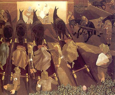
Not everybody was included in the scheme straight away.  Spencer, far away in Macedonia, was initially overlooked and (having transferred to the infantry) faced combat in the final weeks of the war.   He was eventually included, though this did not speed up his demobilisation, which was only expedited when he went down with malaria.  Nevertheless his work was part of the immediate post-war exhibitions of art created under the scheme, most of which now reside in the Imperial War Museum (sadly Spencer’s wonderful painting of army mules watching as the wounded are treated in a field hospital in a strange inversion of a traditional Nativity scene wasn’t loaned to Dulwich).     


Other opportunities briefly opened up in the immediate post war period.   One doesn’t normally think of Lord Beaverbrook- newspaper tycoon and Conservative politician- as a patron of modernist art but in his role as head of Canada’s planned memorialisation of its role in the war he handed out commissions to Bomberg and other modernists.  Unfortunately for Bomberg, his first effort depicting Canadian sappers tunnelling under Hill 60 near St Eloi (see below) drew violent negative reactions from the committee managing the project.  He managed to rework the piece in a way which suited their susceptibilities but the incident left him scarred.   Muirhead Bone, who had been a senior figure in the War Artist scheme, then advised Bomberg that he would struggle to find sales for his works given the style in which he painted.  Bone was highly conservative in his own approach but he had a keen sense of the Zeitgeist.   Even in Paris, capital of the international avant garde, the talk was of “return to order” and neo-classicism- there were even rather bizarre attempts to argue that modernist styles were in some way “Teutonic” and therefore tainted.   Bone suggested that Bomberg might apply for a job as Official Artist to the nascent Zionist settler movement in Palestine.   As a result he disappeared from the mainstream of British and European art for a couple of decades; on his return he was more valued as a teacher than as an artist in his own right and his early works have only been fully rediscovered recently.


The other five enjoyed varied fates.  Gertler never quite found a solid footing in the post war art world and was doomed to be seen as someone who had not really fulfilled his early promise.  The works shown in Dulwich (which admittedly exclude some of his best paintings) suggest that even then he struggled to develop a truly consistent personal style.  Impoverished, marginalised and ailing, he committed suicide at the outbreak of the Second World War.   Carrington’s diffidence about her art became ever more overpowering, not helped by a complex private life spread between Strachey and a series of lovers of both sexes.   She more or less gave up art altogether and when Strachey died in 1931 she chose to take her own life.  

Nash’s war landscapes established him as a major figure in British art, a status which he enjoyed for the rest of his life.   Best remembered for his landscapes, he also dabbled in his own brand of Surrealism and lived to see service again as a war artist in the Second World War where he painted the vapour trails of aerial dogfights and downed German bombers being absorbed into the English countryside.   Nevinson, by contrast, never regained the status he briefly held during the war.  His post-war works were, to put it charitably, of variable quality- as in truth his war time works were also (there is, for instance, an unpleasant undercurrent of misogyny and possibly anti-Semitism in some of the pieces he produced away from the Front in this period).    He tried and failed to break into the American market and ended his days a half-forgotten figure.  It is an irony that a small number of his works from his fifteen minutes of fame have now acquired iconic status, visual clichés for the covers of books about the First World War.

Spencer had always been a sturdy individualist, deeply rooted in the Thames-side rural village of Cookham where he was born (it’s revealing that his nickname at the Slade was “Cookham”).   This was a more remote place in the 1900s than it looks on the map and Spencer’s upbringing in a highly religious family perhaps made it even more remote from the everyday world in mental terms.   Spencer retained a deep, mystical and rather unorthodox Christian faith throughout his life.  Like the fifteenth century Italians he admired, his art was always open to the possibility that the physical and spiritual worlds might intertwine in unexpected ways and that major events of biblical history could play out in the streets of Cookham.   In the picture below, Jesus carries his cross through the village, with the spectators looking out from upstairs windows doubling as the heavenly host and the pointed railings serving as an echo of the spears of the Roman legionaries doing crowd control duties on the way to Calvary.  The men carrying the ladders to assist in the Crucifixion look like a couple of local painters and decorators borrowed to take part in an event which transcends them.   Time and again throughout his career Spencer would project the great events of Christian history and anchor them in the village of his birth.   


Like Nash, Spencer lived to see artistic service in the Second World War.  His area of activity was far away from rural Cookham, in the Clydeside shipyards.  There he drew the workers toiling in the noise and ordered confusion of shipbuilding.   His work there was something of a throwback to the days of careful figure drawing at the Slade- Tonks would have thoroughly approved.


Wednesday, 31 July 2013

Courtly Magnificence and Stuffed Pelicans


There can’t have been many art exhibitions (other than those dealing with the work of Damien Hirst…) in which a stuffed pelican was a key exhibit.  The V&A’s recent show on Tudors, Stuarts and the Russian Tsars, however, had one on prominent display.   The bird in question, now some 350 years old, was one of a pair brought to England by Prince Pozorovsky, ambassador from Tsar Alexei Mikhailovich Romanov to the newly restored Charles II Stuart as a diplomatic present.  It’s pleasing to think that its descendants can still be found taking food from tourists in St James’ Park….

The V&A show shone the spotlight on one of the more unlikely diplomatic linkages in early modern Europe- that between the Russian Tsars and the monarchs of England, then Britain, in the years between the 1550’s and 1690’s -after which Peter the Great’s assertion of his power and his “westernising” domestic policies put his country’s external relations on a new footing..   It was a relationship which began almost by accident.   In 1553 the English mariner Richard Chancellor, looking for a short cut to China across the top of Asia (the “north east passage”) was forced ashore by ice somewhere near the modern city of Archangelsk.  The locals were mightily impressed by the size of his ships and (probably under some duress) sent him off inland to the court of their ruler, Ivan IV (better known as Ivan the Terrible).   Chancellor made a favourable impression there and, to simplify a rather complex tale, the Chartered Company on whose account Chancellor was sailing ended up with a monopoly on Western trade with Russia- as a result of which it took the name of the Muscovy Company.   Ivan was at war with his western neighbours (primarily Poland and Sweden) and was only too happy to establish trading links with a far away but putatively friendly power which could supply him with modern arms and gunpowder.   Chancellor was responsible for shipping the first Russian embassy to England in 1557 (though they ended up shipwrecked on the Scottish coast they eventually made it to London).

This set the scene for relations between the countries for the next century and a half.   Apart from a sticky period under Ivan’s son Fyodor, these were mostly friendly.  This was helped by the fact that they were basically commercial in nature.  Even if the Muscovy Company soon lost its absolute monopoly over Russia’s western trade links it remained a privileged interlocutor of successive Russian regimes for many years.  Russian and British foreign policy concerns rarely overlapped in the 16th and 17th centuries so causes for conflict on that score were minimal.   There were other commonalities.  Both countries sat on the edge of Europe and had complex, often conflicted, relations with their neighbours.   After the very earliest contacts established under Mary Tudor’s Catholic regime, both sat outside the European religious mainstream- England’s idiosyncratic brand of Protestantism with its strong royal role in church affairs was a surprisingly good match for Russia’s status as the only independent Orthodox power of any importance.

In practice most Anglo-Russian diplomacy in this period was funded by the Muscovy Company and responsive to its interests.  This eventually rather irked Ivan who complained to his “sister” Queen Elizabeth about the low social status of the men who were acting as her emissaries to his court.   This was unlikely to cut much ice with the parsimonious Elizabeth, only too happy to run diplomacy with somewhere marginal to her primary concerns on the cheap.   Although the social status of ambassadors on the English side crept up a bit under the Stuarts, relations with Russia remained quasi-privatised.    Individual ambassadors might occasionally play a wider political role. One was instrumental in making peace between Russian and Sweden in 1617 and the Muscovy Company exercised a de facto protectorate over parts of northern Russia during the Time of Troubles between the death of Boris Godunov and the accession of Mikhail Romanov (1605-12).   On the whole, however, the formal relationship between the countries was amiable but distant for the first ninety years.  On a human level exchanges were vastly lop sided; there was no Russian counterpart to the small but well-established permanent English colony in Moscow (some of whose leading lights appear to have very much “gone native”) and Russian visitors to England were rare indeed.

Things changed a bit with the Civil Wars in Britain.  The majority of the Muscovy Company’s directors backed Parliament against King Charles.  A Russian Embassy which turned up in 1645 was warmly welcomed in London but not allowed to cross the lines to visit the King.   Tsar Alexei was not amused.   When news of the execution of King Charles reached Moscow he reacted with horror.  Unlike other European states, Russia shunned all contact with the English Republic and the Cromwellian Protectorate even after the initial shock had passed and became a refuge for the most intransigent Royalist exiles.   The most notorious of these was perhaps General Sir Thomas Dalyell (ancestor of the modern day Labour politician) who vowed never to shave or cut his hair after the kind’s execution.  Presumably he looked a bit less out of place commanding irregular Cossack cavalry in Russia than he did back in Scotland after 1660, where he gained a reputation for extreme brutality in suppressing the illegal open air church services of the religious and political dissidents remembered (somewhat incorrectly) in Scotland as the Covenanters.   

Obviously relations between Britain and Russia resumed after the Restoration (hence the pelicans) but on a rather more “official” basis.  The Muscovy Company’s role was never quite the same either.   Links between the countries remained loose but were conducted on a rather more formal basis.  One has a faint (and quite anachronistic) sense of things marking time until Peter seized control of the Russian state from his sister and encouraging the establishment of permanent embassies on the modern model  (though the St Petersburg Embassy was for many years a place which would-be diplomats tried to avoid being sent to- in modern diplomatic parlance it was a “hardship post” because of the substantial costs which the Ambassador had to meet from his own pocket on order to keep his country’s end up in a very expensive city, as well as the health hazards connected with the prodigious consumption of alcohol in fashion at the Russian court).   It’s an intriguing sidebar to history.   The exhibition, full of beautiful things as it was, didn’t quite map on to it.  


One problem was a basic disparity in material.  The core of the show was a massive (in every sense of the word) collection of English silverware dating from the late sixteenth and early seventeenth centuries.  The majority of the pieces on show came from the Moscow Kremlin museum.  Not all were gifts from king (or queen) to tsar; Russian ambassadors did shopping in London behalf of their monarchs while English ambassadors and the Muscovy Company might make parallel gifts to the tsar or key members of his court.  The cumulative effect however was pretty overwhelming- and must have been equally if not more staggering when the items were ranked up as a collective assertion of royal power and wealth on grand occasions in the Kremlin (most of them were far too grand ever to have been used for anything as vulgar as serving food or drink).  Perhaps surprisingly given Russia’s own turbulent history, English silverware of this period survives rather better in Russia than in England, where much was melted down for the intrinsic value of the metal during the Civil Wars.   Only present at the V&A in virtual form, but presumably one of the centrepieces of the show when it goes to Moscow, the lavishly decorated processional coach presented to Boris Godunov by an English embassy in 1600 also survives as a remarkable example of early coach building.  

The problem is that (stuffed pelicans apart) there appear to be no equivalent surviving items from the presents which the Russians brought to London to balance things out.  This is perhaps understandable as the evidence suggests that the most valued gifts from Russia were consumable items like furs, gems or hunting birds.  Furs were especially prized, especially rare items like Astrakhan lamb which in the 16th century was thought to come from a plant called the “vegetable lamb”.  One of Elizabeth’s ambassadors had to go to extreme lengths to conceal items which he had been given as a personal gift from the Tsar from the queen’s claim to pre-emptive rights over such gifts.   This absence of identifiable surviving gifts is compounded by other cultural disparities between the partners.  Secular painting in any form only began to appear in Russia in the second half of the 17th century so, apart from a couple of small, icon-like, portraits of Tsars Mikhail and Alexei Romanov, there is nothing to compare with the gallery of royal portraits on the English side.   The wonderful portrait of Elizabeth at the very beginning of her reign (see top)- or something derived from it- might just possibly have found its way to Russia if she had shown any interest in taking up Ivan on the proposal of marriage which he sent her in one of his letters (and what a wonderfully improbable match that would have been….) but she turned him down tactfully.   

This disparity of artistic practice also means that, one small depiction currently kept in Hungary apart, there are no images of western embassies being received in Russia.  More surprisingly given that one might have expected a degree of interest in the no doubt exotic emissaries from Russia on the part of London based artists there appear to be no paintings illustrating the ceremonial surrounding the reception of Russian ambassadors there.   The exhibition tried to fill this gap with reference to a series of paintings depicting the pomp and circumstance surrounding the formal reception of a Spanish embassy to Charles II- all very interesting in its own right but somewhat removed from the Russian subject matter of the show (especially as Spanish court dress and etiquette was far closer to that observed in England than Russian practice).   The splendid portrait of Prince Potemkin (a distant relative of the “villages” man) in full Russian finery by Sir Peter Lely below is a rare late example of a Russian ambassador being painted by a London artist and perhaps a sign of future developments with the closer integration of Russian diplomats into the wider work of European diplomacy.


The shortage of “Russian” material led to a slightly blurred focus in the exhibition, which at times seemed unclear whether it was primarily about the Anglo-Russian links or covering a wider “courtly magnificence” agenda.   On the one hand, the choice of portrait paintings (monarchs apart) was very much focused on people with more or less close links to the Muscovy Company, most of whom were London merchants or at most very minor gentry- as a result they were often a bit second division in terms of quality.   Other areas- jewellery and tapestries, for instance- were represented by high quality items with at best tenuous links to the Russian agenda.   This was particularly notable for the early sections.  The Dacre Beasts (below) are fabulous and I really love them (especially the dolphin) but they were made decades before Chancellor set sail for the north.


The same could be said of Henry VIII’s full suit of armour dating from the 1540’s.   It’s a great example of high quality Renaissance armour and a physically imposing presence in the exhibition (even if the Henry’s 54 inch waistline is an ominous indication of how far he had gone to seed physically- in the 1520s’s the figure was more like 32 inches) but again predates links with Russia by a decade and half.


The armour pattern books from the Royal Armouries in Greenwich give a wonderful sense of what the well dressed military aristocrat was wearing when preparing to repel the Spanish Armada but there didn’t seem to be any evidence that Greenwich armour was ever exported to Russia as a diplomatic gift.   These were beautiful things to see but all at one remove from the core subject of the show. 
 

Perhaps it will work better in Russia as a show primarily about English princely display. I wonder if the stuffed pelican will find his way home for a visit….


Wednesday, 17 July 2013

Italian Style- the Photographer’s View


The latest Estorick Gallery show returns to the exploration of Italian photography by looking at the work which Giogio Casali did for the architecture and design magazine “Domus” from the 1950’s to the 1970’s.

Casali was responsible for a very large number of the magazine’s covers in this period as well as providing the pictures for stories about prestige architecture projects and new products in the home furnishing and fittings line.  Indeed he seems to have been the “go to” man when Gio Ponti, the founding editor of the journal as well as a notable architect and designer in his own right, wanted a striking cover during these decades.  These were the years of the Italian economic miracle, when the country went from being a basically rural society with patches of industrialisation round Milan and Turin to becoming a modern developed economy.   Millions of people from the deep south streamed north to work on the Fiat assembly lines or in other factories at the other end of the country (rather than emigrating to the USA, Argentina or France as their grandparents might have done).   Towns and cities across the north sprouted new suburbs, with blocks of flats rushed up to accommodate the incomers.   Even Italian football was affected; the new arrivals in Turin took to supporting Juventus (for years a backwater club favoured by the Torinese middle classes) because the long-established local working class, which rarely viewed the newcomers with a friendly eye, supported Torino.  It was a massive social upheaval.

And you wouldn’t have seen much evidence of it on the pages on “Domus”, at least not directly.   Even though Ponti did design a few (probably rather upmarket) housing developments they don’t feature on the covers Casali helped to create.  The journal was aimed very much at a professional, art-school trained, audience with a certain sale among those social groups who saw themselves as the leaders of fashion and style.       Its world view was resolutely modernist- Frank Lloyd Wright- influenced villas in the middle of the Tuscan countryside, new office buildings on the edge of historic city centres or skyscrapers like the Pirelli Tower in Milan, interior design with strong Bauhaus echoes and so on.    The tone was set by movements like Pop and Op Art. Most of the items depicted on its pages would have been far too expensive for the average immigrant from Calabria struggling to make ends meet in the suburbs of Milan- and would probably have looked bizarre and alienating to someone from that background.  It probably didn’t have that much sale to members of the Milanese working class either.   The wider popularisation of this modernist style would come perhaps a decade later than Casali’s photos.

This rather rarefied social context doesn’t stop Casali’s work from being something of a nostalgia trip for those of us of a certain age.   It’s a remainder of a world where plastic and formica were the last word in modern design and glass and reinforced concrete the marks of up-to-the minute architecture.   I suppose the Sixties are far enough away (and culturally prestigious enough) for not all of it to look hopelessly antiquated and outdated even some fifty years on.   I have a feeling that some of my lovely friends would love to have a try out of the outfit the young lady below is wearing, for instance…..


The Estorick show includes a few of the more iconic items depicted in Casali’s photographs.   Some, like the “Superleggera” chair whose virtues are being illustrated (probably by Casali’s wife) at the top of the page, cleave to a functionalist aesthetic.  Others are a bit idiosyncratic.   Take the “book chair” illustrated below.   People at the opening night of the show spent much time debating how they thought one was supposed to sit on it.  The majority view was that the model had it wrong and that the “natural” way to engage with the seat was to turn the leaves over until you arrived at a comfortable angle and sit with your back against the upright surface this created.  Sadly we weren’t allowed to try it out either way. 


 Either way, they convey a sense of style- and articulate the image of an Italy which was both very much at the forefront of design with qualities which stood comparison with the great achievements of the national past (as suggested in the juxtaposition of Brunelleschi’s Dome on Florence Cathedral with modern design items in the shot below) and thoroughly integrated in the cutting edge international design culture of the day as defined in New York or London or Paris.   In the divided political and social cultures of Cold War Italy, “Domus” was clearly on the Christian Democrat side, even if the stricter brand of Catholic might have been uncomfortable with the hints of elite decadence some images suggested. 


This implicit alignment perhaps explains the at first sight surprising number of pictures of new churches which found their way into the pages of “Domus”.   Obviously the massive population shifts created an urgent requirement for churches in the new suburbs.   Even in the south new churches were required- Ponti’s striking co-cathedral below was built in the southern port of Taranto to supplement a medieval building which had become inadequate for the needs of a population vastly expanded by the establishment of massive steel and chemical works (which made Taranto one of the most polluted cities in Italy…).    


Even as church attendance began to drop off in Italy (and I wonder how many readers of “Domus” were devout church goers) church commissions provided a steady flow of income for architects and designers.   At times the results have a slightly dream like quality.  Take the design illustrated below (Casali had a reputation for being able to photograph design models in ways which made them look “real”- but he had his work cut out on this one).  This looks a bit like a spaceport from a Dan Dare strip (giving my age away there…).  It’s actually a design for a church which was supposed to be built beside the Sea of Galilee.  It dates from the mid 1960’s in the euphoria following Pope Paul VI’s visit to the Holy Land; unsurprisingly the project appears to have fallen victim to the politics of the Middle East though I wonder how “buildable” it actually was even if war hadn’t intervened.  


Estorick regulars recalling a show a few years back on Italian design in the 1930’s might have wondered whether “Domus” wasn’t guilty of a little selective amnesia over its own past by the time Casali started collaborating with the magazine.  “Domus” was not a new title in the 1950’s.  Ponti founded it in 1928, fell out with the team running it in 1941 and regained control in 1948.   In other words, it appeared regularly right through the high years of the Fascist regime.   The famous “Superleggera” chair, with its use of non-traditional materials, looks remarkably like a belated child of that regime’s “Autarchy” drive which I’ve written about before (and the web site dedicated to preserving the memory of Gio Ponti’s life and work implicitly locates a lot of  his design work, including the “Superleggera” in that period, not post-war).   Indeed there were distinct family resemblances between quite a few of the ultra-modernist high tech consumer items made out of new plastics in the 1930’s and goods being produced, also out of plastics and other “artificial” materials, which were highlighted on the pages of “Domus” from the 1950’s.   The quality and durability of the plastic was obviously a lot higher second time round and the products probably worked a lot better but in design terms the linkages were there.  

Obviously the Estorick show wasn’t to blame for Ponti and “Domus” being a bit economic with the truth about what they’d been doing in the Ventennio.   It was however a little disappointing in another way.  Despite Casali’s obvious skills with the camera, he remained a rather shadowy figure as an individual.    Clearly he didn’t start taking photos in the 1950’s.   He was born in 1913, evidently lost both parents at an early age and started working as an errand boy for a photographer in his early teens, picking up his camera skills as an apprentice there.   He set up his own studio in Milan in 1938.   The show includes a tiny number of photos which predate his “Domus” collaboration and reveal a different side to his art- a couple of slightly brooding landscapes daring from the war years but with no indication of what he as doing then (he would have been well within call up age in 1940).  


 It also includes some of what amount to his holiday snaps from trips to Spain and the Italian south (unlike some professional photographers Casali clearly enjoyed taking his camera on holiday and snapping what he saw around him- and his holidays intriguingly seem to have been spent in places where the “Domus” aesthetic was hardly known).  These are several cuts above the normal holiday album fodder and again are rather different from his “professional” work, full of people going about their work and play in rather down at heel surroundings.   In all honesty I found them more attractive than the skilful but sometimes slightly superficial work he did for a living and I’d have liked to know rather more about the man behind the camera than we’re given in this show.


Wednesday, 26 June 2013

Where it all began….


Sorry for the long break.  I’ve been away a lot, both business (a couple of visits to Dublin, which only gave a brief taster of the place) and pleasure (the annual visit to Orkney- which included the best weather I’ve see this summer).   I’ve also been having all sorts of issues over Flickr.  I tend to assume that most of my readership here is steered over from Flickr, where I tend to post at least some of the photos I include in my postings.  I really can’t get on with the “new look” Flickr.  I find it clunky and confusing to engage with- and so slow that I’m having to cut back the number of people I can engage with in any depth.   I’ve set up an alternative home on a site called Ipernity, whose look is a lot more like them old Flickr and rather reminds me of the old Yahoo 360 (anybody still alive who recalls that?).  I suspect it was a something of a French Flickr knock-off (if you look closely it’s apparent that the default language was originally French) and I also suspect that it was not the most active of places until a few weeks ago.   There has been something of a migration of girls I know and like from Flickr but (inevitably) there are still a lot of people I don’t want to lose contact with on Flickr who probably have too much invested in time and effort to want to move from there.  Equally it’s not yet clear that Ipernity will get the critical mass necessary to sustain interest (or indeed how the folk who run it will react if they suddenly become the default site for t-girls and their admirers- there is some evidence to suggest that their filtering for rude stuff isn’t all that well developed or robust!).   While Ipernity has a blogging facility I don’t think I’d be able to shift all of this over there.  So the net result is that I guess I’ll have to remain here and double post the photos to both Flickr and Ipernity.   This in itself has been a bit of a discouragement from setting finger to keyboard…..As a result, I’m well behind on writing up the exhibitions that I’ve been to, with the result that some of my comments are going to be very much in the past tense.   

This certainly applies to the British Museum show on Ice Age Art.  This was sub-titled “The Making of the Modern Mind”, which certainly raised a few questions in my (hopefully modern) mind.  Part of the point of the show was to exhibit artefacts from the very distant past (anything up to 40,000 years ago) as works of art rather than simply archaeological finds; to underline the point, a number of 20th century pieces were slipped into the exhibition.   I don’t have any real problem with this- there is pretty good evidence that Picasso, to take one example, was interested in and influenced by examples of Palaeolithic art which were discovered in France in the 1930’s, like the example below.


I’m a little less than totally convinced by the associated argument that the Ice Age societies in question included what amounted to a group of “professional” artists who underwent lengthy training (argued on the basis of finds made by clearly less skilful hands- interpreted as apprentice works), though it’s certainly clear from attempts to replicate some of the more complex items on display that creating them might take several hundred person hours which couldn’t be spent hunting or gathering.   The assumption that creating sophisticated visual art is constitutive of a “modern” mind, however, jars just a little.   What about cultures which chose other ways to address the issues that the groups covered in the exhibition dealt with in visual terms?   There was glancing reference to music (a flute made from the wing bone of a very large eagle) and even to dance (there is evidence from one of the decorated caves in France that people danced there- but might there have been dancing at sites which had not been modified by human hand?) but nothing about language and oral cultures.   There are societies in the contemporary world which are no great shakes at visual arts but cultivate very complex verbal cultures.  Don’t they have modern minds?   I imagine the concepts and the underpinning brain science are quite a bit more complex than they appeared in the exhibition catalogue, which at times read faintly like an impact report from the Paleolithic Arts Council seeking extra mammoth steaks on behalf of creative artists….

None of this questions the power, beauty and sophistication of many of the pieces in the show.  Ironically the least effective part of the exhibition was the section which sought to display the most famous Ice Age art- the cave paintings of Lascaux and their equivalents (badged up as examples of a “Renaissance” as the ice receded northwards some 20,000 years ago).   Obviously this sort of art can’t travel and the attempt to display it in audio-visual terms in a pseudo-cave really didn’t work that well.  

On the other hand the show did a very good job of displaying free-standing sculptural artefacts, including images etched into ivory or horn or even stone.   The number of items on display was not huge, which meant that one could actually look at them in the round (though obviously the requirements of modern lighting meant that one had to use some imagination to get a sense of how they might have appeared in the flickering light of fires or torches; from archaeological contexts it appears that some at least were meant to be viewed under those conditions).   They also came from a relatively limited number of sites (presumably to simplify borrowing conditions), though ones spread over a huge geographical area, from Derbyshire to the southern edge of Siberia, and covering an almost unimaginably long time span (something like 30,000 years).

Despite the intention of presenting the exhibits in aesthetic terms as works of art, it was obviously impossible to avoid speculation about function.   I repeatedly found the word “enigmatic” cropping up in my mind when looking at objects.   Take the female figurines (see top).   These massive women with huge breasts and (possibly, sometimes) heavily pregnant are something of an Ice Age cultural constant with versions being found in more or less every major site across the entire period covered.   It’s less clear what they “mean”.   The tendency has been to interpret them as artefacts underpinning a fertility cult, with very grand speculative reconstructions of matriarchal social structures sometimes built on this (curiously a certain brand of feminist-inflicted archaeology doesn’t have any trouble at all with recycling notions of Primitive Matriarchy first dreamed up by a mid- nineteenth century German professor called Bachofen whose works became massively popular with the more occultist type of Nazi).   Even on that basis there are puzzles.  Are these supposed to be idealisations of “ordinary” women (how many enormously fat women would there have been in the average hunter-gatherer band, even granted that such groups are often more sedentary than they appear at first sight)?    Priestess/shaman figures?   Goddesses?   Is it significant that, with the exception of items found at one site, they’re always depicted as nude even though nudity was probably relatively uncommon in Ice Age societies?   Some of the figurines appear to have been quite deliberately smashed and disposed of.   Why?   Punishing the goddess when a pregnancy went wrong?   Shifts in the belief system that we can now only guess at?   Could they even have been children’s toys, broken when their owner reached puberty?


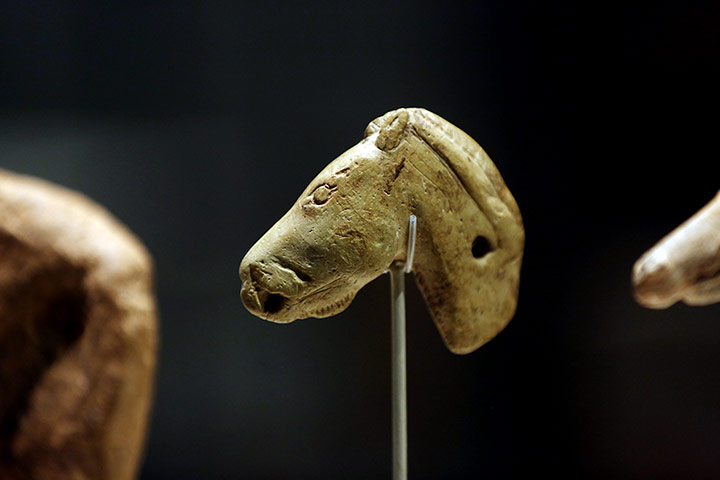
Some of the same issues surround the beautifully observed images and depictions of animals like the bison and the horse shown above.   There are, for instance, disjunctions between the range of animals depicted in art and those which the archaeological record indicates were hunted (or at least consumed- it’s entirely possible that Ice Age people scavenged dead mammoths rather than hunting living ones).  To take an example, only one image of a wolverine has ever been found (it was in the show) even though these giant members of the weasel family were evidently hunted for their fur (and were quite fierce enough to pose a genuine test of skill and courage).   Again the assumption is that animal depictions link in with factors like seeking the aid of Higher Powers for a successful hunt, taking on the spirit of chosen animals at certain times or even totemic symbols of certain groups.  It’s easy to see why one might admire the speed of a horse or the ferocity of a bear and wish to take on something of their spirit -or want to apologise to a bison for killing it so that its spirit doesn’t haunt future hunts or say thanks to a mammoth for feeding the group through the winter.   Quite why a wolverine wasn’t due the same degree of respect is less clear…..  And just possibly there was no religious purpose in any of these images- the exhibition’s own premise of looking at them as works of art opened the door to other possibilities.

I have to admit that I have a slight issue with what seems to be a default archaeological position which interprets any artefact which doesn’t have an immediately obvious utilitarian purpose in spiritual terms.   It was faintly gratifying to find included in the exhibition a group of items- lavishly decorated batons of a rather unusual shape- which had for years been interpreted as non-functional symbols of power and authority but on a recent re-examination were now interpreted as spear throwers- see below for an example.   Sometimes functionality is not obvious but it’s still there.  


There also seems to be a permanent tendency to assume that all Ice Age religion was “shamanist” and interpret finds by heavy reference to the religious practices of contemporary peoples who practice “shamanism” (whatever that means- I’m not sure it’s appropriate to collapse the belief systems of peoples from Papua New Guinea to Central Africa via Amazonia and Siberia into one “ism”, as if they’re all offshoots of one core faith; this sounds uncomfortably like a politically correct 21st century heir to19th century attempts to identify a common religion of Humankind).  

I suppose it must be tempting to assume very long continuities in places like Siberia- especially as it’s awfully easy to project Ice Age life styles on to people who still live in very cold conditions there.   “It’s all religious” sounds more impressive than “we don’t really know- it might be religious or it might be something else entirely”.  Nevertheless I do find the rather easy assumption of very long continuities and the associated tendency to make use of contemporary practice (or sometimes practice recorded by anthropologists in the recent past) to interpret archaeological finds 30,000 years old a bit simplistic.   There’s good evidence that the content of Siberian “shamanism” has shifted considerably over time- and that anthropological informants might more or less consciously have shaped their accounts to make the practices of their people “understandable” to observers or to hide the truly key aspects of practice and belief from unsympathetic ears.   To be fair, the exhibition catalogue was a good deal less “shaman-centric” than some accounts of remote antiquity I’ve read and noted problems with some of the arguments for very long continuities, such as the long term impact of Tibetan Buddhist imagery on decorative items worn by modern shamans which provided a much more plausible explanation for the presence of certain motifs than long term survivals from the Palaeolithic suggested by some Soviet era researchers.    The shadow of the shaman did however hover in the background and at times I felt individual items were being over-interpreted to fit this model.

Perhaps the most enigmatic item of all was also one of the oldest.   He can be seen below- the Lion Man of the Hohlenstein Stadel.  He’s about 40,000 years old and pretty amazing.   The story of his discovery is rather complicated (and I suspect the version given in the catalogue glossed over a few awkward points).   The simple version is that he was discovered in pieces during a dig by a couple of professors from the University of Ulm.  The discovery was made in August 1939 just as the dig was being wound down with the outbreak of war and the mobilisation of the diggers.   The finds disappeared into a store and were only looked at again in the late 1980’s, when the Lion Man was revealed in his full glory.  

I’m afraid my nasty historian’s mind starts asking a lot of questions here.   The date of the find sets all sorts of bells ringing in my mind.   The archaeology of very ancient times was a deeply political subject in the Third Reich.  Though Hitler himself wasn’t remotely interested in the distant Stone Age past (an Aryanised version of Classical Antiquity was what got him excited), others were.   Prehistoric archaeology was fought over by competing organisations, one ultimately under the aegis of Alfred Rosenberg (the Party theoretician, who had an ill-defined but at times important role in areas of cultural policy like archaeology) and the other affiliated to Himmler’s SS, the Ahnenerbe.   There wasn’t much ideological difference between Rosenberg and Himmler.  Both dabbled in Nordic neo-paganism and both nourished fantasies about lost Aryan golden ages in the far distant past when everything that mattered in civilisation was invented in the north by a pure master race- the disputes between them were almost entirely an issue of personalities.   Nevertheless the net result was that just about every serious academic archaeologist in Germany ended up affiliated to one or other network and reliant on them for funding and support.   I find it very hard to believe that the Hohlenstein dig wasn’t undertaken under the auspices of one of them- and that the outbreak of war may have done the Lion Man no end of a favour.   If he’d been found and identified a couple of years earlier there’s no doubt at all in my mind that he’d have been hugely instrumentalised as living evidence for the glories of the remote Aryan past.   Outside Germany I suspect he’d have been dismissed as a crude fake cooked up to fit a political agenda and post war would have become so tainted by Nazi associations that no “serious” archaeologist would have risked their career by challenging that interpretation.

I’m glad the Lion Man didn’t suffer that fate.   One can still feel the power he gives off even 40,000 years on and this is one case where I don’t have any difficulty at all in accepting that he must have been part of some religious belief system.   It’s intriguing to find that he isn’t self-standing- he’d have had to be propped up against something or have his feet planted in a soft surface in order to stand tall.  This implies, perhaps, that he moved round with his people, a guide and protector to them.  Perhaps his spirit kept an eye on the British Museum exhibition too……